Qlife Announces Rebranding from Pinsheng Medicine to Pinsheng Healthcare and Launches New Brand Identity
Recently, Qlife Medical, a leading enterprise in clinical mass spectrometry, officially announced its name change to “Qlife Medical,” with the English abbreviation “Qlife.” The company’s full name is now “Jiangsu Qlife Medical Technology Group Co., Ltd.” (formerly known as “Shenzhen Institute of Life and Health Medicine Co., Ltd.”). Concurrently, Qlife Medical officially unveiled and fully implemented its new Visual Identity (VI) system. This signifies that after several years of rapid growth in the field of clinical mass spectrometry, Qlife Medical has achieved substantial progress across all business sectors, entering a new stage of high-quality development. Driven by a strong desire for innovation, the company has launched this brand renewal initiative, marking the beginning of its next “Golden Age” with a refreshed corporate image.
Why was the name changed to “Pinsheng Medical”?It is understood that Pingsheng Medical has been deeply engaged in the domestic healthcare market. As a high-tech innovation company focused on the field of precision medicine, it adheres to mass spectrometry technology as its core and multi-omics research as its driver, consistently remaining at the forefront of innovative diagnostic product development and application.
Since its establishment in 2016, Pingsheng Medical has experienced rapid growth, developing a comprehensive clinical mass spectrometry solution that encompasses omics research services, mass spectrometry instruments, reagents, and diagnostic applications. The company has served hundreds of partner hospitals and earned widespread recognition.
It is reported that, leveraging years of accumulated expertise in proteomics and metabolomics, the R&D team at Pinsheng Medical has independently developed and established qULTRA, a world-class precision omics platform. This platform transforms cutting-edge omics research technologies into solutions truly suitable for large-cohort, scaled clinical testing applications. It opens up new directions for the application of multi-omics technologies in clinical laboratory medicine and provides a solid foundation for Pinsheng Medical to utilize its omics platform to screen for and discover more biomarkers and drug development targets.
The rebranding from “Pinsheng Medicine” to “Pinsheng Medical” signifies that Pinsheng Medical will continue to emphasize its industry focus on precision medicine services, extend into deeper medical scenarios, and build a precision medicine ecosystem.
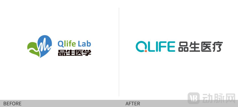
Furthermore, the English abbreviation has been upgraded from “Qlife Lab” to “Qlife.” Qlife, the English name adopted by Pinsheng since its inception, stands for “Quality Life,” reflecting its commitment to serving quality life through technological innovation. The upgrade from “Qlife Lab” to “Qlife” signifies that the company is not merely a precision medicine laboratory, but a provider of one-stop precision diagnosis and treatment solutions, dedicated to advancing human health and enhancing the quality of life.
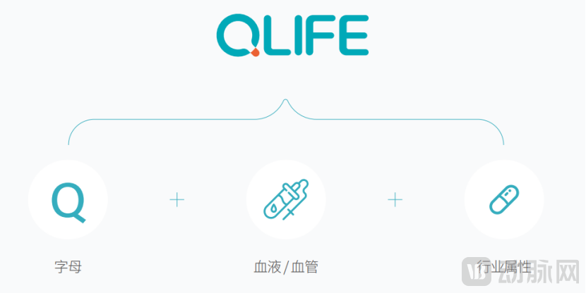
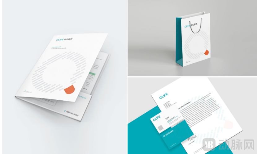
What is the special significance of the new company logo?The QLIFE Medical logo primarily consists of the text “QLIFE Medical.” The graphic mark is a stylized redesign of the letter “Q,” which serves as the initial of the brand name, ensuring brand exclusivity and uniqueness.
The design of the “Q” logo not only incorporates the initial “Q” from Qlife, the English name of Pinsheng Medical, but also integrates medical symbols such as capsules and test tubes into the graphic, representing Pinsheng Medical’s corporate philosophy of focusing on precision medicine. From a distance, the “Q” resembles a bright lamp, symbolizing the company’s unwavering commitment to exploration and technological innovation. With multi-omics technology at its core, the company aims to build a new ecosystem for precision medicine, letting mass spectrometry technology illuminate more lives.
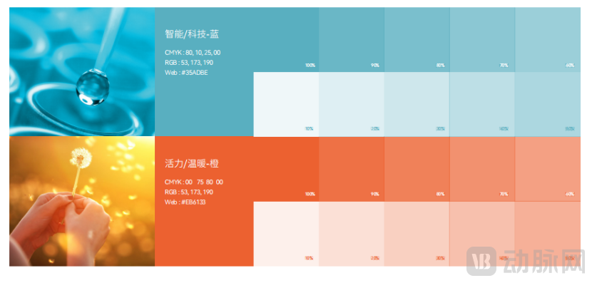
In terms of logo colors, Intelligent/Tech Blue is adopted as the primary brand color, highlighting Pinsheng Medical’s industry attributes of intelligence, technology, and wisdom. Meanwhile, Vibrant/Warm Orange is incorporated to reflect Pinsheng’s passion and enthusiasm, demonstrating its wholehearted commitment to providing customers with more humanized, warm, and professional services.
Overall, Pinsheng Medical’s new logo undergoes a comprehensive transformation. Its bold and confident symbolic expression, coupled with a clean and streamlined design, enhances its international appeal. While highlighting Pinsheng Medical’s distinct brand identity, the new logo aligns with the company’s global vision and international corporate image.
In fact, behind the friendly and bolder visual symbol lies Pinsheng Medical’s inner spirit of empowering precision medicine through technological innovation and pursuing excellence in innovation.
In the future, the new logo and supporting graphics will be applied to product lines, packaging, and communications, gradually reaching users over time.
Regarding this brand upgrade, Dr. Cheng Xiaoliang, Founder, Chairman, and CEO of Shenzhen Institute of Life and Health Medicine Co., Ltd., stated: “Pinsheng Medical has always been a company that continuously evolves and innovates. The previous logo had been in use since the company’s inception; while we are reluctant to part with it, replacing it is an inevitable step aligned with our overall corporate development strategy. Our corporate strength and brand enhancement continue to grow, yet our enduring commitment and original aspiration to advance mass spectrometry technology in China remain unchanged.”